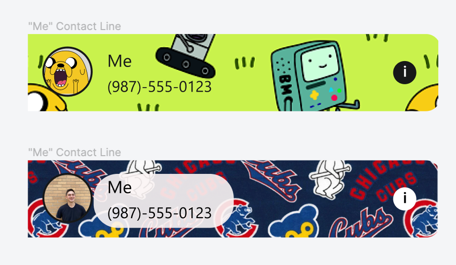
Create a new feature where users can divide payments within CashApp
A case study through the University of Wisconsin-Madison. I am not affiliated with Cash-App
My Role
UX Researcher
UX Designer
Tools
Figma
Photoshop
Google Drive
Platform
Mobile App
Introduction
Cash App is a popular peer-to-peer (P2P) payment service where users can send each other individual payments. In an effort to expand even more services offered, the company has proposed and implemented the introduction of bill splitting when eating at restaurants/other venues. I conducted market and user research and then designed and tested a solution that is easy and allows all parties involved to be aware of what they are paying another user for.
My Role
UX Researcher
Competitive Analysis
User Interviews
Persona
Emotional Journey
Usability Testing
UX Designer
Product Ideation
Product Flow
Low and Hi-fi Prototype creation in Figma
UI Designer
Developed layout of components
Created components in Figma
Selected colors for components
Problem
No app exists that allows the user to send money requests and payments across multiple users at once
The current person-to-person money-sharing apps tend to focus only on one-time expenses or recurring expenses.
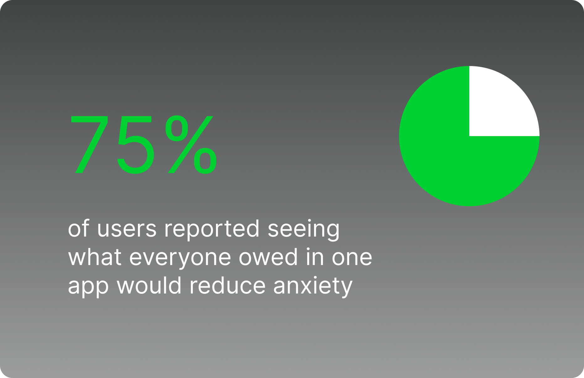
Splitting the bill makes people anxious.
Our research reported that splitting the bill made people uncomfortable because they wanted to make sure they were paying their fair share and not being taken advantage of.
Goal
Design a feature for customers to divide larger payments to other CashApp members. This process should be easy and allow for all parties involved to be aware of what they are paying another user for in order to reduce the anxiety of the user.
Research
Competitive Analysis
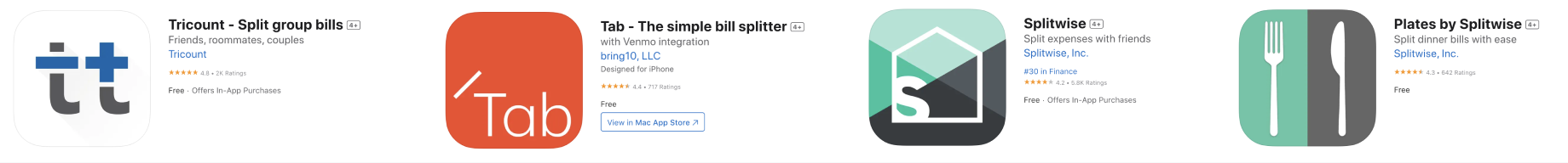
I completed a competitive analysis of the top expense-splitting apps on the app store and found:
These apps use a specific system using colors or icons so it is clear that items are differentiated,
Entering individual items for a receipt is cumbersome, some apps allow you to scan receipts to speed up the process.
Apps seem to specialize in one-time splits or recurring group expenses.
User Interviews
I wanted to see how users went about splitting the check without this feature in order to determine how the experience felt for users and where it could be improved.
According to our interviews, the users usually split the check at a restaurant by someone putting their card down and then telling everyone to “Venmo them”. The price of Venmo depends on the person but users report that sometimes it is uneven and it is not always socially acceptable to call someone out for it.
According to our interviews, the user's ideal process involves something with transparency, does not take a lot of time, and is simple to use.

In order to better empathize with our end users and keep on track, I created a persona using the data from our user interviews.
Persona

Emotional Journey
To even further empathize with users, I put our persona Sam in a situation of paying the check at a restaurant which as you can see became a stressful and awkward situation. She didn't get as much food as others but had to pay more and felt this was very unfair. She found it to be awkward to bring this up and was worried that she will carry resentment between friends. Something that should be a fun get-together amongst friends left Sam feeling very frustrated. The process of splitting the check was stressful especially if you’re on a budget like Sam.

Main Research Takeaways

Spitting expenses can be anxiety provoking for people
Colors and Icons can be helpful in differentiating users


Users want a process that is transparent and fast
Ideation
Sketching
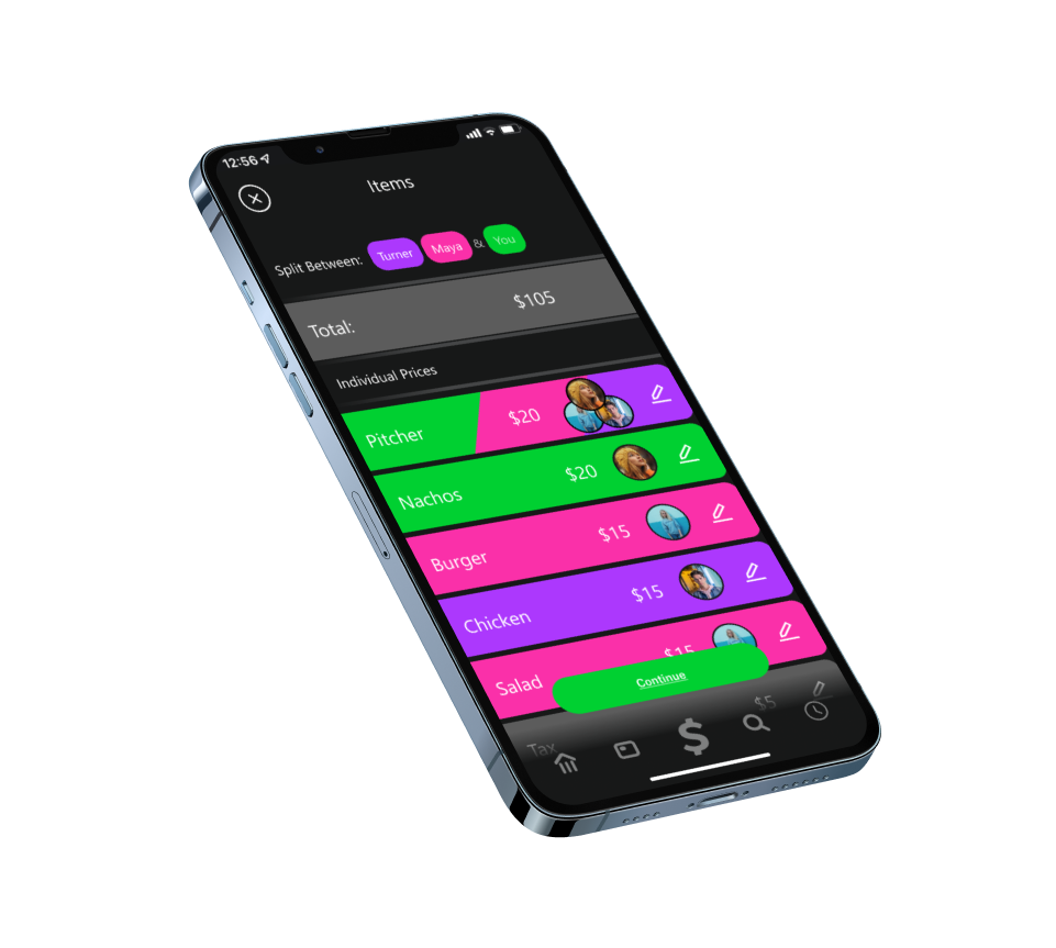
Differentiation of expenses, and simplicity were top of mind when creating a solution. In these sketches I demonstrated a way where each user can be assigned a color and how a easy tap can be used to assign the user/color to an item while using UI that already existed within Cash App.
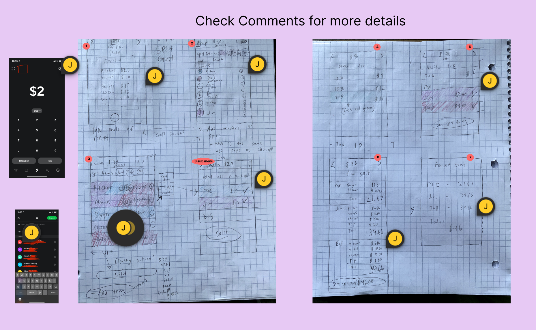
Mid-Fidelity Prototype
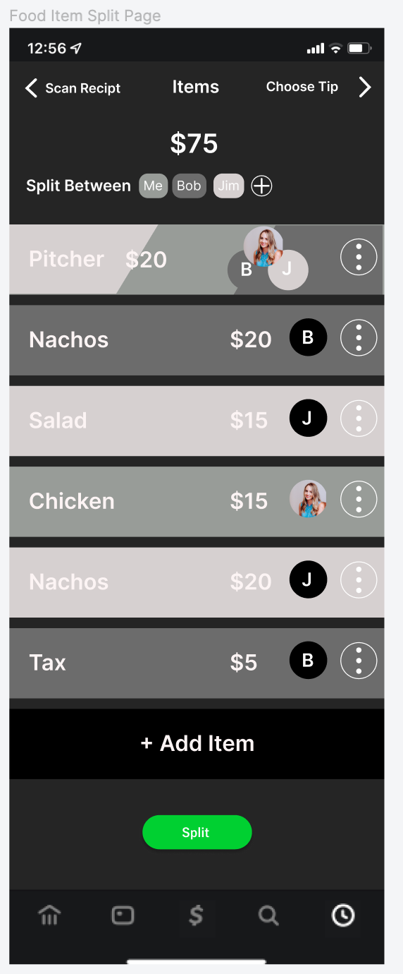
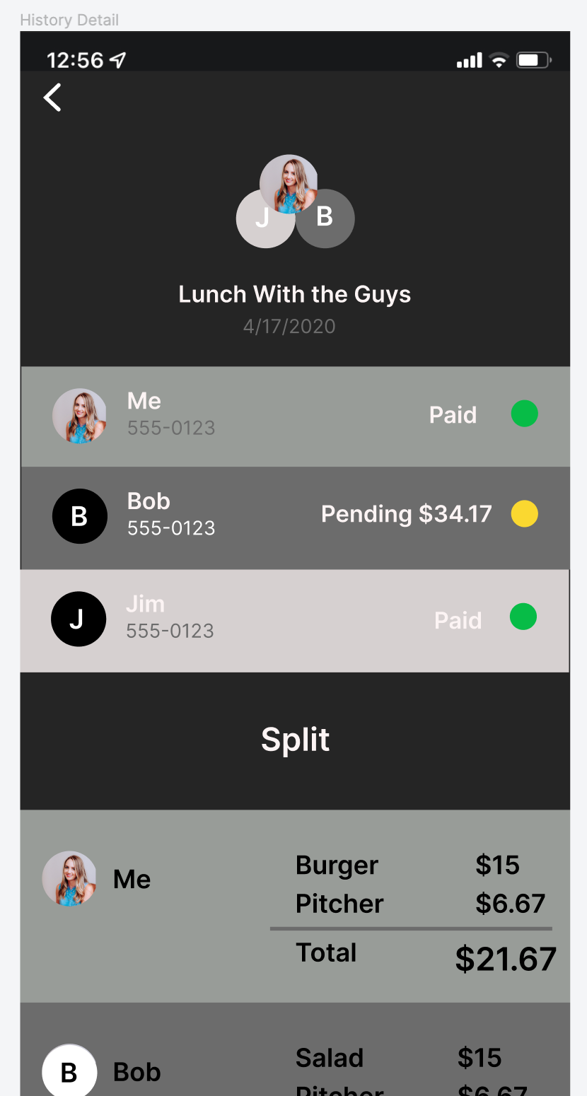
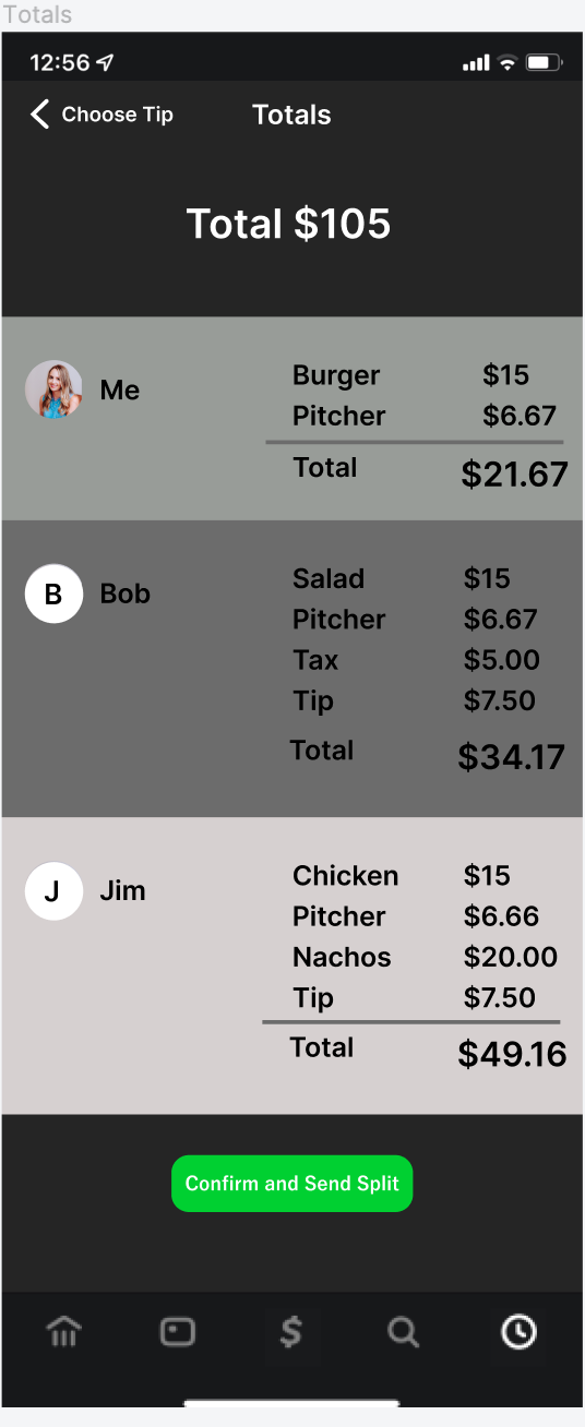
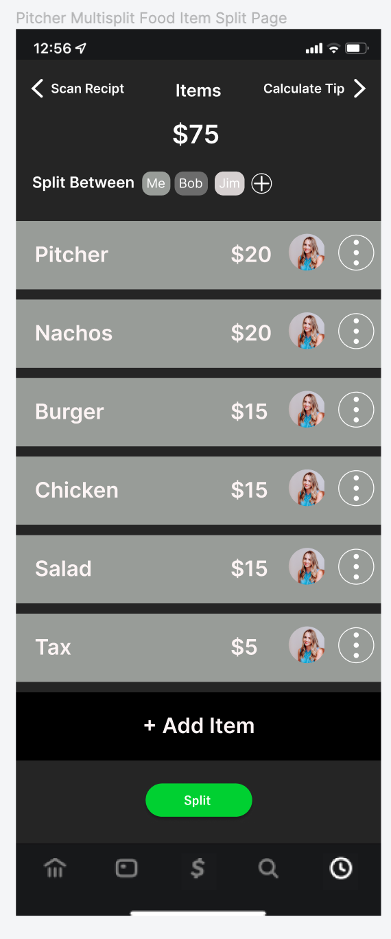
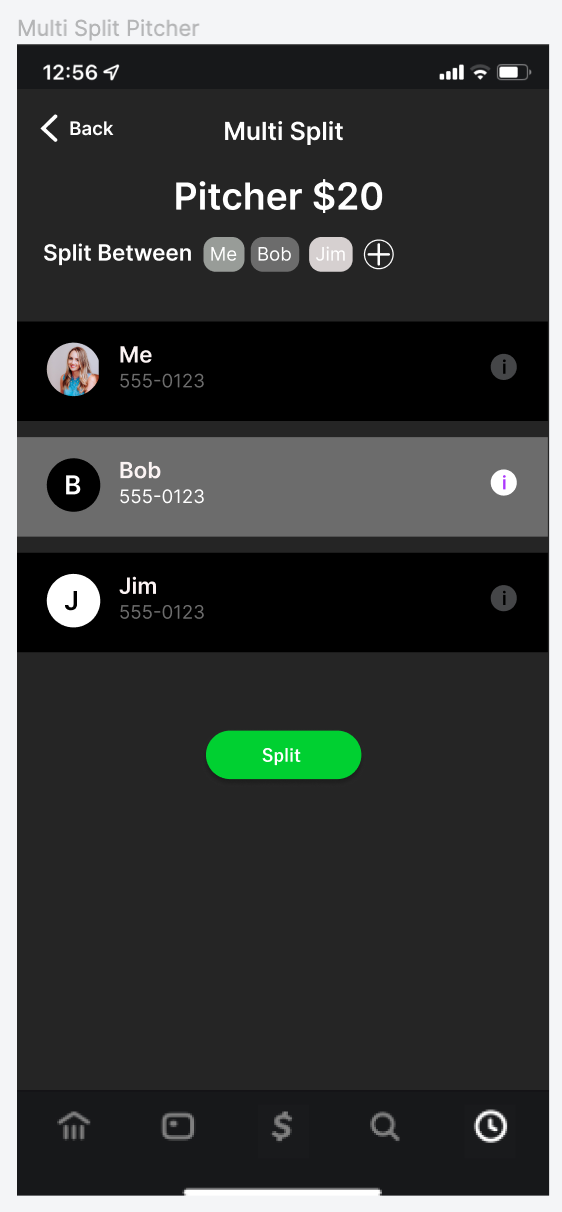
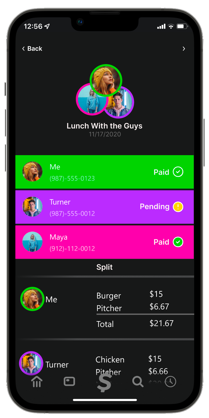
Color and user icons are used to indicate who owes what. The user can go through and tap each item from a scanned receipt to change the color and icon to match who purchased the item. Items split more than two ways can be split using the “multisplit” feature by selecting the three dots icon. Users can also check who has paid and who hasn’t through a history section accessed through the homepage.


User Testing
I completed usability tests with the mid-fi prototype to discover any problems with the flow or design.
The main problems I found were:
The distinction between paid, pending, and failed was unclear to users
“Multi-split” was hard for users to find
There were accessibility issues related to color blindness.

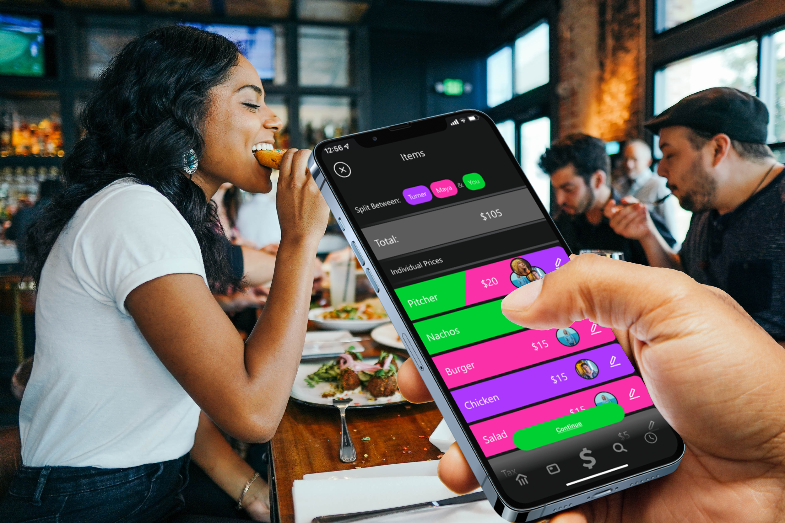
Final Design
The final prototype shows a solution that allows users to divide larger payments to other CashApp members. The process is simple to use, using single taps and only one sub-menu item if necessary, and it allows for all parties involved to be aware of what they are paying another user for and if that user has paid in order to reduce the anxiety of the user. Multi-Split was made easier to find via a new icon and the accessibility and pending vs paid issue was solved via using an icon as opposed to only colors.
Future Steps
User Testing
More user testing is needed to ensure users know how to use the multi-split function.
Marketing
An online ad campaign can be launched on social media showing off the new feature and educating users on the multi-split function.
Custom Banner Store
Cash-App could offer a store in order to purchase customized banners for even more ways for users to differentiate between each-other.
See More

Research & design a way to display sustainability data in an effective way that builds user trust ↗
Research how Monday.com might improve the ease of use and reduce the learning curve of their platform. ↗
Increasing Intakes for a Mental Health Private Practice by 320%↗