
Help a platform improve its ease of use and reduce the learning curve so that trial users convert.
A case study through the University of Wisconsin-Madison. I am not affiliated with Monday.com
Tools
Figma
Google Drive
My Role
UX Researcher
Platform
Customizable web and mobile work management platform
Introduction
Monday.com is a cloud-based Work Operating System platform that allows teams to run projects, workflows, and create their own applications and work management software. There appears to be a high “learning curve” when it comes to making use of the platform. Monday.com needs the platform to keep the current feel of its experience while improving its ease of use to reduce the learning curve so that trial users convert.
My Role
UX Researcher
Analyzed Qualitative Data
Completed a product audit
Reviewed user interview scripts
Assembled an affinity map of reported issues
Created Persona
Made an emotional journey map
Constructed a site map
ideated possible solutions
Developed a new and old UX Flow
Presented research findings to stakeholders
Problem
After completing their two week trial, many users report that they still don’t know the platform well enough to make a decision about using it.
There appears to be a high “learning curve” when it comes to making use of the platform. Monday.com needs the platform to keep the current feel of its experience while improving its ease of use and reduce the learning curve so that trial users convert.
Goal
Synthesize and present solutions for Monday.com to find out how they might reduce the learning curve of their app for users on a team.
Research
Approach
Empathy was the key to tackling this problem. First, I needed to find out why users found the platform overwhelming and hard to learn.
User interviews gave me insight into what specifically was overwhelming others about Monday.com. From those interviews, I was able to create a persona and hypothesize how they would interact with the application in order to reveal more pain points.
Synthesize User Interview Data with Affinity Map
The three user interviews revealed that the main issue with Monday.com was that users had to go to multiple different places across the software to retrieve the data they needed. This led to split reporting and more work for users.

“With the dashboard, they can only show so many tables at once,
so you end up having a bunch of tables across Monday you end
up needing multiple dashboards. Multiple dashboards mean the analysis is split.”
“The same information in multiple places requires multiple updates on multiple boards due to a lack of sync. Its easy to become overwhlemed”
Persona
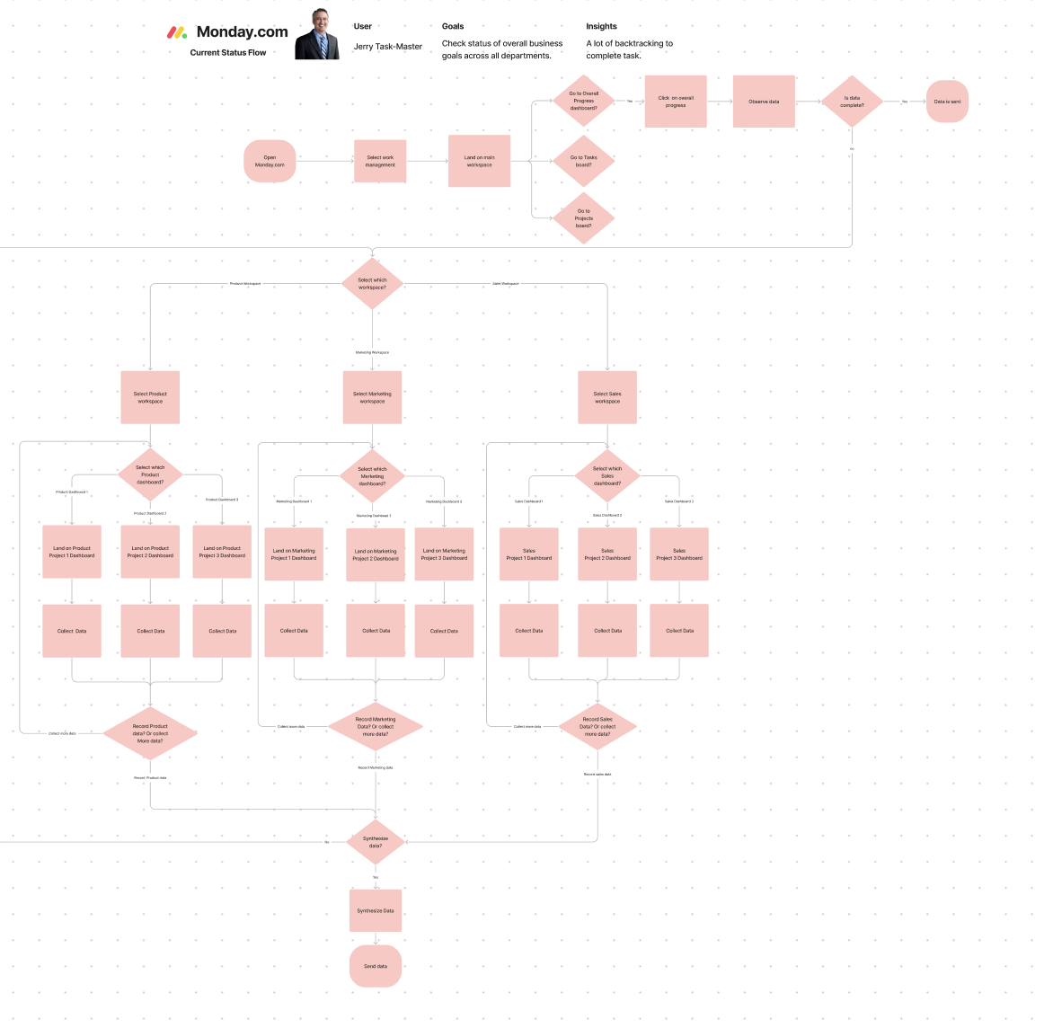
In order to better empathize with the users and expose more pain points, I created a persona who would use Monday.com to consolidate overall progress data for his company. Consolidating data across different departments and dashboards was the perfect goal to understand what the users explained in their interviews and better understand their pain points.

Product Audit
In order to really empathize and get a better understanding of Jerry’s experience, I signed up for a Monday.com account and created fictional Product, Marketing, and Sales departments each with personalized tasks, boards, and dashboards, for Jerry to synthesize.

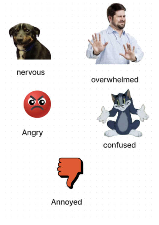
Emotional Journey Map
I wanted to see what Jerry was doing, how they were feeling, and what they were thinking while going through the process of synthesizing data. This gave me the specific insight that most of this process was confusing, overwhelming, or annoying for Jerry.

Site Map
A site map of Monday.com also confirmed the users and Jerry's experience shows that there are a lot of different places data can be.
Findings
There was no clear, effective way to see consolidated data over multiple workspaces and dashboards
This was reported in our extensive user interviews and something we found using our persona and flows.
The current setup creates more work for users and can lead to irritation, therefore people do not extend their trial
Our user interviews and emotional journey mapping found that all the backtracking users need to do to get the data they need creates more work for them and makes them irritated.
How might we reduce the number of dashboards users need to look at in order to get the information they need?
Ideation
The Main Workspace
Jerry’s UX Flow showed that if there was a Main Workspace where data can be consolidated, the user can avoid a lot of backtracking while seeking out data within the program instead of consolidating data outside the program. This matched the experiences of our user interview reports and user journey.
UX Flow if Main Workspace is effective
In this first flow section, Jerry goes to the main workspace. In an ideal flow, the data would be complete and he would be done right then. In this case, and in the cases of our user interviews, the data is incomplete to Jerry is forced to seek out the data in the individual workspaces.

UX Flow if Main Workspace is ineffective
If the main workspace does not show the consolidated data properly like it does right now, Jerry has to go through each individual departments workspace dashboard to collect the data. Jerry has to backtrack a lot in order to ensure he collects all the data he needs.

Solutions
Create a Main Workspace where users can see consolidated data
Having a hub for users to look at selected consolidated and synchronized data will drastically reduce users workflow.
Create more customizable widgets that can allow for users to display selected data from across dashboards.
A widget that synchronizes and consolidates specific data can be placed on a specific dashboard, or the main dashboard will reduce the user’s workflow while adding more customization.
Create a tutorial or chatbot for users to better be able to use the synchronizing tools that already exist for dashboards.
If a solution for data synchronization and consolidation already exists with monday.com, but users are unaware of its existence or how to use it. Highlighting these features may help users consolidate and synchronize their data more effectively.
See More

Research & design a way to display sustainability data in an effective way that builds user trust ↗
Research & design a feature for customers to divide payments with others ↗
Increasing Intakes for a Mental Health Private Practice by 320%↗