Case Study

Design a feature for customers to divide single payments with others within Cash App.
Case study project thorough the University of Wisconsin- Madison UI/UX Bootcamp.
**I am not associated with Cashapp**
My Roles


Team
UX Researcher (me)
UX Designer (me)
UI Designer
Project Manager
Tools
Figma
Google Drive
End Users
Cash App users
Time
2 Weeks
The Problem
Problem Statement
The goal of this project is to design a feature for customers to divide larger payments to other Cash App members. This process should be easy and allow for all parties involved to be aware of what they are paying another user for.

Design Process

Empathize
We’ve all been there right? Someone calls for the check and everyone gets all awkward. “Who is gonna put their card down?” you think, “ I really only got one thing and Jerry is over there with 3 drinks”. Maybe you’re the one who is paying the rent and everyone has to pay you back but that one roommate always takes a little too long. Talking within my team we all agreed that splitting the bill with multiple people can be an overwhelming, frustrating and sometimes confusing process. I set out to find out what this experience was like for others and how they went about splitting money to see if there was a better way.
Research Questions
What are the best apps out there already for splitting the check and payments.
How do people go about splitting expenses right now?
How do people feel when splitting the check?
Competitive Analysis

After googling the top expense splitting apps, I chose the top 4 that appeared most to compare their features: Splitwise, Tricount, Tab, and Plates.
From a competitive analysis I found that
Apps seem to specialize in one time splits or recurring group expenses.
Apps had a clear system of differentiation for users and expenses using colors or icons.
Entering individual items for a receipt is cumbersome but the technology exists to scan a receipt and then edit the items digitally.

User Interviews

We conducted three user interviews. Criteria for these user interviews were that the participant must use a cash sharing app (such as venmo, cash app, splitwise, or zelle) and participants must regularly use these apps to split bills. After reviewing the user interviews I found that:
Users find the process of splitting bills anxiety provoking due to feeling as if they can easily be taken advantage of.
Users usually split the check at a restaurant by someone putting their card down and then telling everyone to “Venmo them”. The price of the venmo depends on the person but users report that sometimes it is uneven and it is not always socially acceptable to call someone out for it.
Users split bills by sending a request usually in Venmo or Cash App. Users report they are fine with that process.
The user's ideal process involves something with transparency, does not take a lot of time, and is simple to use.

Persona

Based on our user interviews we came up with a persona that best matched the data. This is Sam she is very budget conscious and she knows how frustrating it can be when the check comes and you have to split the bill between a group of friends. Sam knows when the bill comes the mood can shift because no one wants to throw their card down. Splitting the check can have you paying more for something leaving you very frustrated.

Persona Emotional Journey

I put our persona Sam in a situation of paying the check at a restaurant which as you can see became a stressful and awkward situation. She didn't get as much food as others but had to pay more and felt this was very unfair. She found it to be awkward to bring this up and was worried that she will carry resentment between friends. Something that should be a fun get together amongst friends left Sam feeling very frustrated. The process of splitting the check was stressful especially if you’re on a budget like Sam.


Define
The key insights from our research illustrated the stressfulness of splitting expenses. Testers told us the best app would offer transparency and reduce the anxiety inherent in insisting the user only pay what they owe. We also learned that color is helpful. The solution has to be simple and faster than saying “Venmo me.” Apps currently focus on one time expenses like split a restaurant tab, people thought adding recurring and group expenses might be tricky.
Research Key Takeaways
Splitting expenses can be stressful for people.
Users thought the best apps would provide transparency and reduce the anxiety associated with only paying for what you owe.
Colors and icons can be a very useful tool in order to differentiate between who owes what.
The process needs to be simple and faster than someone just asking people to venmo them.
Apps tend to focus on one time expenses vs recurring or group expenses.
Prototype

Our research said that this is an uncomfortable experience, so it is important that it is fast, simple, and transparent so everyone felt comfortable with what they were paying in the end.
Sketches
Differentiation of expenses, and simplicity were top of mind when creating a solution. In these sketches I demonstrated a way where each user can be assigned a color and how a easy tap can be used to assign the user/color to an item while using UI that already existed within Cash App.

Mid- Fidelity
Working off these sketches I created interactive components. Each user will be randomly assigned a color. Tap on the item and the color and user icon will change to indicate who is paying for what. To split something more than one way, you would tap on the three circles to enter the multi split menu


Testing

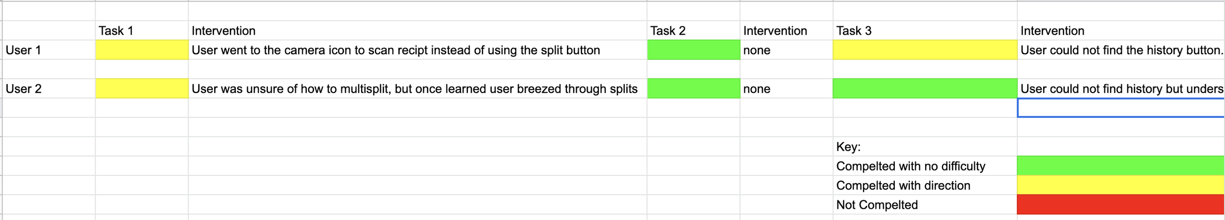
I conducted two usability tests. I wanted to test if this system of splitting expenses felt transparent, clear, fast, and simple enough for users that they would experience less anxiety splitting expenses.
We wanted users to complete the following tasks:
Split a restaurant bill between me, Bob, and Jim.
Check History / Review previous receipts and transactions.
In order to get a feel for how this would impact their anxiety splitting the check, I asked the following follow up questions:
What are your overall impressions of this feature?
Would you use this?
Was it clear who was paying for what?
How would using this app make you feel when splitting a check?
Does this seem easier or more complicated than just asking people to Venmo them? Explain.
What features would you add? What features do you think are unnecessary?
Results
“It would make me more aware of what I am getting and make me feel more comfortable getting certain things knowing everyone can see who got what.”
“I didn’t know I had to tap on the multi split first but once I knew how to do it, it was super simple.”
“It was clear and fun to tap though and change ownership of items.”
Key Takeaways From Usability Testing
Users were able to complete all tasks without too much difficulty or direction
Colors were useful in differentiating things.
We need a clear way to differentiate between request and split.
How can we make multi split more obvious?
How can we make the distinction between paid, pending, and failed more clear?
We need to make sure we are taking into account color blindness.
Once users knew how to interact with multi-split vs assigning, it was really easy for users to use.

Prototype

Overall, task completion was very high for users once they understood how multi-split worked. In order to make things more clear to users, we added more colors and more specific icons. This also served a purpose regarding accessibility as the more ways we can display that items are different and what they can do, the clearer it will be for all users. At this point in the project, I handed off most of the work to our UI designers and Project Manager. I contributed to the hi-fi by adapting some components to color, and helping build out the wireframe.
High- Fidelity Finished Product
The hi fidelity used more colorful UI and more specific icons in order to ensure that it was clear who was paying for what. We made sure to make the icons different and clear in order to accommodate those who experience difficulty seeing color.


Conclusion
We found out that by being able to do one-time and recurring payment splits in an app that is already built around payment will be a big competitive advantage increase the number of users for Cash App since it would do it all within the same app. The research showed people wanted a simple to use app that will increase transparency between everyone splitting the check so no one would feel resentful against others who got more items than others. Using colors and simple tap interactions, we were able to create an experience that will reduce resentment, anxiety, and stress associated with splitting money and dare I say, kinda fun to use.
See More Work
Case Studies


Freelance Work