Case Study
A template that increases transparency between companies sustainability mission and users to create more trust.
Case study project through the University of Wisconsin- Madison UI/UX Bootcamp.
**I am not associated with Patagonia**
My Roles


End Users
Environmentally conscious users
Tools
Figma
Google Drive
Team
UX Researcher
UX Designer
UI Designer
Time
4 Weeks
The Problem

Greenwashing is when an organization spends more time and money on marketing itself as environmentally friendly than on actually minimizing its environmental impact. Because of this, customers are skeptical of companies who claim to be sustainable due to other companies lying about their sustainability practices.

Problem Statement
How might we help ethical businesses display their policies, effect, and commitment to protecting our world?


Design Process
Empathize

Research Focus
“Recycle your bottles” says Coca-Cola. “Only you can stop climate change” says BP. Okay, but aren’t y’all the ones destroying the environment? It makes sense that my teammates were skeptical of companies that are making claims they are being environmentally friendly. It can be confusing to know who to give your money to if you are someone who wants to be environmentally conscious with your spending. We know there are good companies out there like Patagoina, Pela, and Nvida that are doing helpful things for the environment, but because of companies like BP and Coca-Cola, people can be skeptical. Or maybe thats just us. We wanted to help the companies that are actually doing the environmental work gain the trust that has been broken by greenwashing. We started our research with this guiding question:
What specific information about environmental sustainability can a company show, in order to increase the trust the consumer has in the company?
We further broke this question down into three questions that could be answered with specific types of research and analysis.
What are the ways companies show they are climate conscious?
What are consumer thoughts on climate conscious companies?
What are specific elements of climate conscious marketing and what do customers think/feel about them?

What are the ways companies are showing they are climate conscious? - SWOT Analysis
We looked four companies websites & completed a SWAT analysis on each to see how they displayed their sustainability data. We chose two companies we knew to have environmental missions: Patagonia & Girlfriend Collective and two companies we thought to be greenwashing: BP and L.A. Colors.

After recording how they displayed their data, we found 5 main ways companies display environmental data on their sites:
Photos documenting and providing evidence of sustainable practices
Links connecting company to sustainable certifications
Sustainability plans
Articles about how they are being sustainable
Graphics showing sustainability projects


2. What are consumer thoughts on climate conscious companies? - User Survey
In order to get user thoughts on climate conscious companies we created a user survey that included questions on general thoughts on sustainability, questions about users feelings about greenwashing, and included photos of different sustainability marketing strategies for users to rank based on user trust. We had 11 responses total.
We learned from our survey that others are also skeptical of companies claiming to be sustainable.

“It does seem that all companies are trying to cash in on being eco-conscious”
“Companies claim to be environmental friendly when they are literally coal and oil companies.”
3. What are specific elements of climate conscious marketing and what do customers think/feel about them?
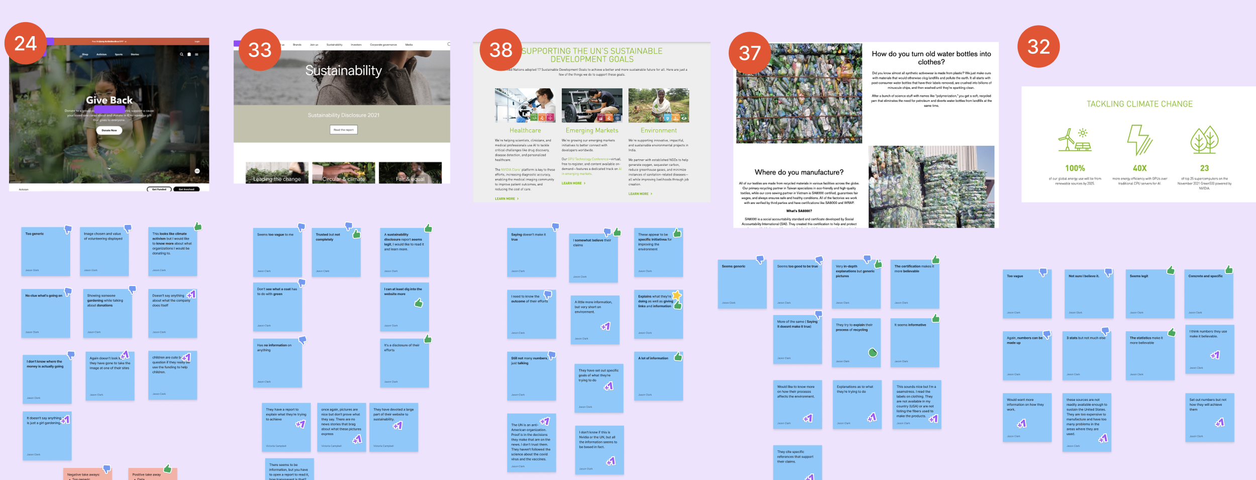
At the end of the survey, we provided 9 examples of climate conscious marketing and asked users “On a scale of 1-5 how much does this image make you trust that this company is sustainable?” and had them elaborate on why.

Participants of our survey liked:
Data with specific numbers & statistics
Links
Certifications, more in depth info
Transparency
What are you doing, how are you doing it, how is it impacting the environment / others

Participants of our survey disliked
Vague Visuals
Generic photos
Generic Graphics
Lack of information
Numbers with no backup evidence to support


Persona

Using the demographic data from our 11 survey participants, we created a persona of someone who would be interested in the environmental data of a company.

In order to get a better idea of what our target user may be feeling when they see companies environmental sustainability data on their website we gave Hannah the task of buying yoga pants.
Persona Empathy Map

Pain points
From this exercise we learned that our target user could feel:
Uncertain if the company is being truthful
Guilty over not feeling like they want to pay that much for a sustainable product
Anxiety over buying something that may not have a good impact on the environment
Possible growth points
If a person feels more certain that their money is going towards a sustainable goal they will feel less guilty and more willing to spend money on the product.
We can reduce anxiety about supporting a environmentally sustainable company by showing legitimacy in a company's sustainability practices.
What can companies do to communicate their sustainability efforts effectively to their consumers?
Research Main Take Aways

Data = Trust
Specific numbers and data led to more trust. It was important to users that this data was easily digestible

Take the user on a journey
Providing full transparency on how the product is made and its impact from beginning to end made users feel more comfortable

The more specific the better
We saw an increase in trust when users had a lot of links to stories, data, certifications and endorsements.

Beware of generic
Generic photos and data led to user distrust that they company was not actually doing what they said.

Define
The research showed users wanted to see the actions companies were taking to be sustainable throughout the creation of the product and the product’s lifecycle. The more specific, and the more the company displayed certification and links to outside sources, the more a user trusted that product.
Ideate
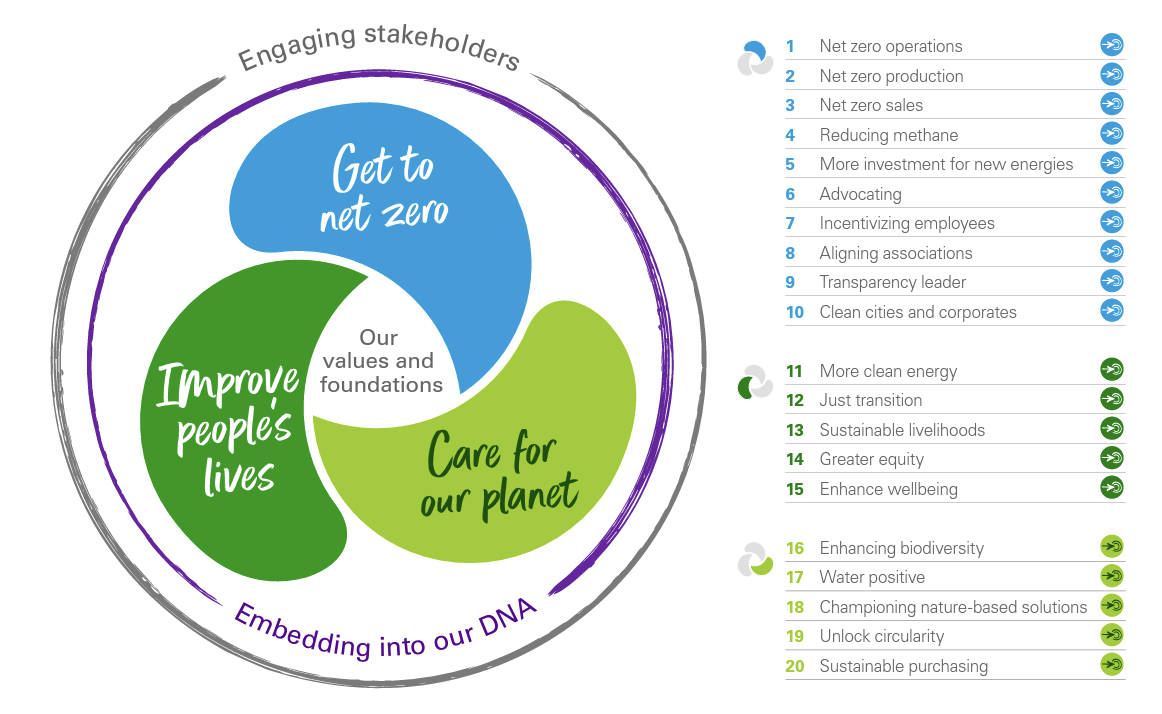
After brainstorming and sketching designs, we determined that an interactive timeline where a user can see the sustainability story of a product from creation to end of lifecycle would be the most effective way to build trust according to our research. We were curious about how the sustainability timeline would differ across different product industries so we decided to make a timeline template that different companies can enter their data into.


Prototyping
Mid-Fidelity Prototype
I created my mid-fidelity timeline for the clothing industry. I decided to put sustainability data from Patagonia into my sustainability timeline template due to them having a lot of data available.
According to our research, users wanted to know all the sustainability information was available but did not necessarily want to read it. This prototype allows the user to see a shortened version on the data in card form and gives them the option to continue on to read more in-depth info. This prototype template also has places for specific photos, and links to outside organizations that will verify the company is doing what they say, another important feature according to our research.
Testing
Mid-Fidelity Usability Test

The purpose of the usability test was to test whether users feel more trust in the company’s sustainability mission when they are shown the full environmental impact of a product's timeline. We found that a company displaying their data in a timeline increased trust as long as other information and links were present.
The main questions we wanted to answer for our usability tests were:
Do people understand the purpose of the sustainability timeline?
Can they navigate the timeline?
Are users able to find sustainability information easily?
Does the timeline format make them feel more trust towards the brand / product?

Mid-Fidelity Usability Test Main Takeaways
Users struggled to know what they can interact with.
Users wanted cards that were aesthetically pleasing and indicated better what users can interact with.
Users wanted earth tone colors and button colors that indicated importance
Users wanted a better navigation experience once they entered the learn more part of the site


Prototyping
High-Fidelity Prototype

In my final design I wanted to avoid information overload. I focused on how to condense large amounts of data in the designs that was still available to users if they wanted to explore the information in further detail.
This design meets the criteria for all of what we learned from our research:
It gives users a view of the products environmental impact starting from from the materials the product is made from to how it can be recycled
Has links to outside sources in improve credibility
Has a condensed version of what the company is doing that doesn’t force users to have to read a lot of text but has with the option to read more.
Conclusion
Lessons Learned
This was the first UX project I ever did from conception to final project, and it was hard. At the end of it, i feel like i am definitely coming out wiser and more skilled.
The research will show the way
Asking the right questions and knowing were to look for those questions is important. Once you ask the right questions with empathy, the research will lead to the answers. It is about the users.
Communication is everything
This was the first time I worked on a UX team. We did a great job communicating and had great systems for organizing our files and data.
Research and Prototyping are my strengths
What I enjoy most about UX is find the answers to questions using my empathy and curiosity. It was thrilling to watch the research slowly unfold and tell me what I need to make and then even more fun to build it.
See More Work
Case Studies


Freelance Work
